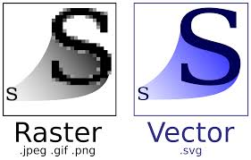
Let’s start with a raster graphic. Raster images are ones that are made up of pixels. Have you heard people (usually designers or printers) talk about DPI before? Well, DPI stands for “Dots Per Inch”. The correct way to say this should be PPI, which stands for “Pixels Per [Square] Inch”. This is a reference to the amount of color pixels inside a 1″ square. If the PPI is 300 then we are talking about 300 pixels per square inch. The higher the PPI, the higher the “resolution” (A word that usually get thrown around a lot with DPI or PPI). Web graphics are more often than not saved at 72dpi. This is because the less PPI, the less data there is and the smaller a file size can be. When people are building website that need to load quickly, size is very important. BUT, printing is the exact opposite. 300dpi is the bare minimum when printing. Some magazine print at 600 and higher. Some over 1000! As you can imagine those file sizes can get fairly large. All photographs are made up of pixels. In fact, most cameras brag about how many “megapixels” they are. This is in reference to how many pixels a picture taken with that camera will have total. As explained, the more pixels the higher the resolution.
Let me introduce you to a potentially new word, “Pixelation”. Pixelation is one of the major draw backs to working with pixel based graphics (raster images). Pixelation comes from enlarging an image more than it’s intended or original size. If you take a graphic that is 300dpi and is 2″ x 2″ and print it, the result would be nice and clear at that size. But if you stretched it out to be 12″x12″ it would reduce the amount of PPI to 50 from 300. That is because even though the size changes, the amount of pixels has to stay the same. This creates chunks of missing data and causes the photo to look very blocky and not smooth. Some software out there, such as Photoshop is very intelligent. And instead of simply enlarging the image and leaving the missing pixel data, it will take it’s best guess at the missing pixels based on the pixels it sees. It will look at one pixel that has a hexadecimal of #009123 and then there are 5 missing pixels and then another pixel with a hexadecimal value of #009129. It would assume that the values of the 5 missing pixels are #009124, #009125, #009126, #009127, and #009128. While this is smart and would create a smooth gradient of color between the two pixels, it doesn’t account for the natural shades, shadows, highlights, and other naturally occurring differences in lighting. While this looks better than no pixel data at all, it doesn’t always fully trick the human brain and eyes. More often than not, the human brain picks up on something “not looking just right” about it. And sometimes it comes off looking somewhat blurry.
Sometimes in graphic design, we need to make an image VERY large. For instance, when a large sign is needed. Imagine a billboard. If you logo is raster and designed at 2″. Even at 300dpi, it is only large enough to print maybe business card size. Imagine stretching that graphic out to fit a billboard. The result would be so blurry and pixelated that you wouldn’t even be able to make it out. This is where something like vectorization could come in handy. Which brings us to our next, word…
Vector graphics are graphics that are made up of lines and shapes, not pixels. They have no pixel data whatsoever. Because of this, there is no resolution, DPI, PPI, etc. The raster images can be stretched as large as needed and the lines and shapes remain crystal clear and very sharp. Vector graphics tend to be created in software such as Adobe Illustrator and come in the following formats; AI, EPS, SVG, and sometimes even PDF (can be both vector and raster). Vector graphics are easily edited, scaled, and because they lack all that pixel data, VERY small in file size. This makes them ideal for multiple marketing and graphic design uses.

